WHAT IS A BRAND
There are countless ways to describe WHAT IS A BRAND.
We like Monigle Associates’ words:
“A brand is a promise, a trustmark. It is a signal to consumers as to what they can expect in terms of quality, reliability, service and commitment. Brands instil confidence. They serve as a shortcut to decision making because as consumers are peppered with hundreds of competing and confusing messages, they will seek out the brands they know and trust.”
HOW ARE BRANDS BUILT?
Our design practice often agrees with the BrandAsset® Valuator (BAV) theory developed by the Young & Rubicam Group: The process of building brands, BAV demonstrates, is reflected through a progression of four primary measures (the four pillars): Differentiation, Relevance, Esteem, and Knowledge. These four pillars are consistently linked to a brand’s ability to deliver revenue and profit for its owner.
The following are some of our projects that are Brand and Identity focused.
IPG Real Estate website
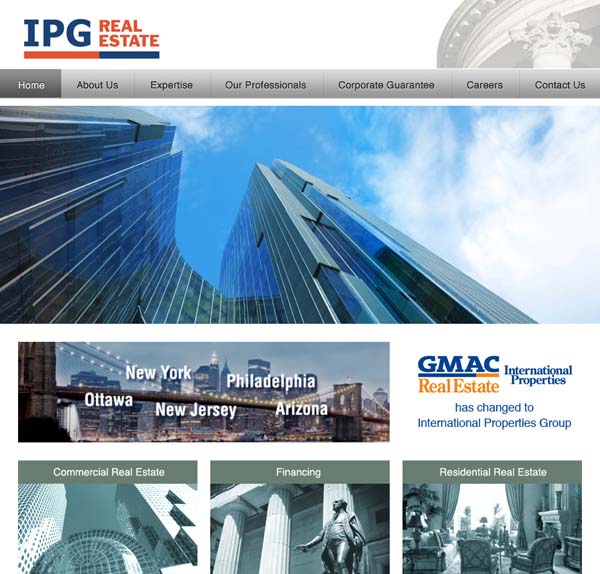
IPG Real Estate is a NYC based commercial real estate company. Its predecessor GMAC Real Estate International Properties Group is a prestige brand in the industry.
IPG retained GRIDNYC to design and build its website, ensuring the prestige brand status is not lost in the name change.
CAREA Journal
The Chinese American Real Estate Association (CAREA) organizes many events throughout the year. CAREA’s Journal is an important communication device that not only introduces the organization to trade professionals and consumers, but also collectively strengthens the “Identity” among its members.

Case: Branding KEYNOTE
In mid-2013, we received an inquiry about our marketing experience on technology product. In response, we went into our archives and located a few examples. The product we dug up may appear outdated, but the branding strategy was a winner:
Client / product / market: Keydata International / “KEYNOTE” brand laptop computer / U.S. consumer, dealer, value-add reseller, and government (GSA) markets.
Service: GRIDNYC developed “KEYNOTE” product brand, packaging, and advertising from strategy to execution.
Formula: Strong product + truly professional service (more than 50% of their tech support team holds an EE or CS master’s degree) + competitive pricing = KEYNOTE’s growth strategy.
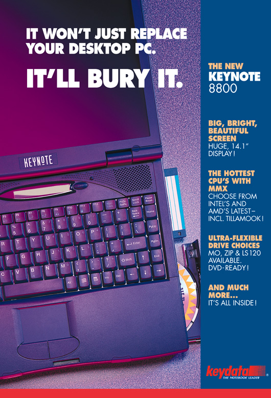
We built the “KEYNOTE” brand to reflect these qualities: From one of their ad headlines you can feel the brand’s confidence (below sample 1).
A little humor can drive the point too, the “YES, Keynote…” ad (sample 2) earned many smiles as well as orders!
Extra Mention: Stephen Chang’s advertising design for “Keynote 8560″ was selected and published in the Marketing textbook Consumer Behavior — Building Marketing Strategy (McGraw-Hill) as an example of effectively using Preference Strategy.
( From one of their ad headlines you can feel the brand’s confidence )
( A little humor can drive the point too, this “YES, Keynote…” ad earned many smiles as well as orders )

Grand Pacific
Headquartered in New York City, Grand Pacific (GP) is the North American affiliate of Chailease Group, a financial service provider based in Taiwan. This Group, together with Chinatrust Commercial Bank, forms the largest financial service conglomerate in Taiwan.
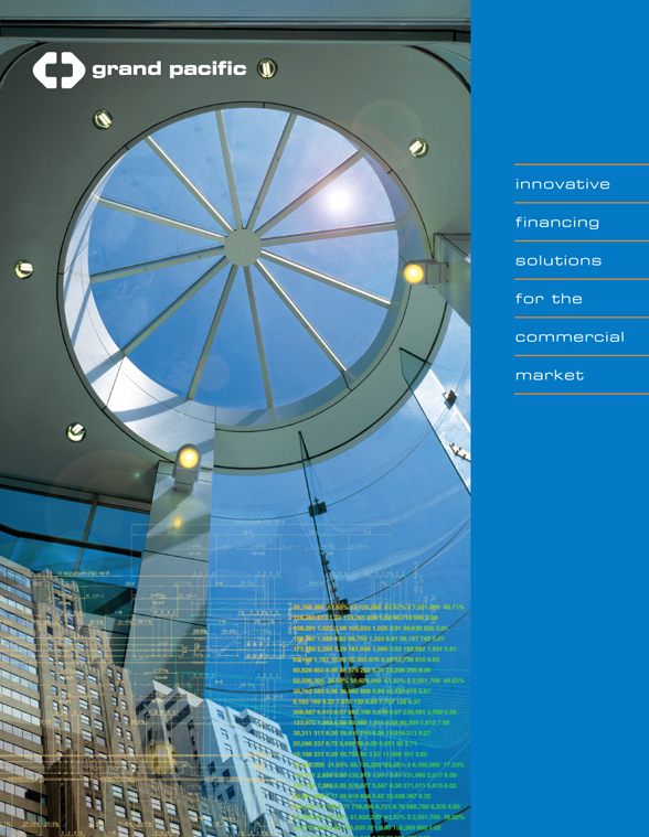
In 1998, Stephen Chang was retained to develop Grand Pacific’s first U.S. market entry brochure, in which GP leveraged its Taiwan affiliation and financial strength, with an international business scope.
Nine years later in 2007, GRIDNYC was again retained to design a second marketing brochure. Already established in the U.S., this time GP focused on the national market with well defined product offerings and value propositions. The reference was no longer on Taiwan, but on its U.S. track record.
We developed both brochures from concept, copy, layout, design, to final artwork and printing. When the second brochure was delivered to GP’s office, the Senior VP in charge joked: “We have to live up to this brochure now!” It’s a complaint we are happy to hear.
Case: Branding Digiview
Digiview is a computer monitor private label brand created by Continental Technology Inc. (CTI). GRIDNYC was retained to assist CTI to develop this brand in the dealer / VAR market.
We designed Digiview’s Brand Identity devices including the brand logo, product packaging, literature standards, sales sheets, POPs, gift items, and trade magazine ads. We also enable CTI to promote Digiview monitors through its distribution channel ads, together with other brand monitors and PC components.
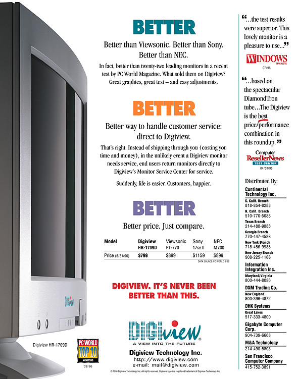
When Digiview HR-1709 model was named PC World magazine’s “Top 10 Monitors,” we seized the opportunity to create a “Better, Better, Better” ad campaign (below sample 1), which substantiated the “Digiview advantages”——based on that evaluation report.
This ad campaign successfully put Digiview on the national bestsellers list and established its reputation as a good value brand. More positive reviews followed.
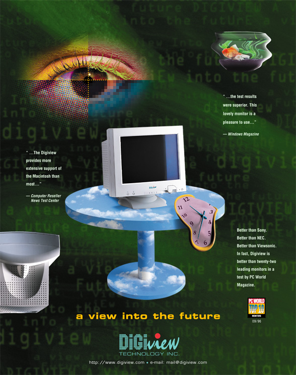
As Digiview’s business accelerated, CTI decided to strengthen Digiview’s brand recognition and to differentiate / elevate the brand image. This time, we created the “Futuristic Monitor” brand-image ad (below sample 2), which was run for more than a full year on multiple trade magazines. Combined with poster/POPs and gift items of the same design theme at retail outlets, the campaign successfully promoted the entire product line of seven different models.
CTI and its Digiview brand were later bought out by another corporation.
“Better, Better, Better” ad:
“Futuristic Monitor” brand-image ad:
